About the Project
NovaConstruct required a complete brand identity and web design structure that positions them as a modern, reliable leader in high-scale building and structural engineering. The goal was to align their visual presence with their commitment to precision engineering and upward development.
The Challenge
The construction market is saturated with generic, dated visual identities. NovaConstruct needed a brand system that stood out as clean, contemporary, and institutional—instilling immediate trust in commercial clients, real estate developers, and corporate stakeholders while reflecting forward momentum.
Brand & Design Strategy
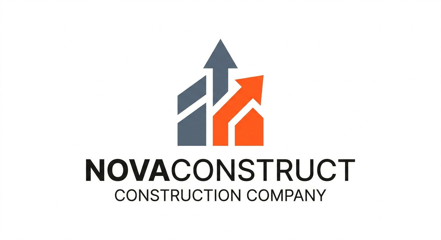
- Logo Iconography: The visual mark incorporates geometric building silhouettes seamlessly integrated with dual upward-pointing arrows. This symbolizes structural stability, continuous growth, and modern engineering standards.
Color System:
Slate Grey (
#4A5568): Conveys structural strength, steel, concrete foundation, and corporate reliability.Safety / Industrial Orange (
#F95716): Adds energy, high visibility, precision, and modern field activity.
Website & Execution
- Enhanced Brand Perception: Transformed the company’s market position to target mid-to-large-scale commercial developments.
- Cohesive Touchpoints: Delivered a unified visual framework across digital web interfaces, corporate proposals, and physical site assets.
Key Deliverables
- Brand Identity Strategy & Logo System
- Brand Style Guidelines (Typography, Color Palette, Visual Rules)
- Custom Digital Web Platform Development
- Responsive Web UI/UX Design System