About the Project
Amelie Crunchy needed a warm, inviting, and appetite-appealing product design identity for its gourmet snack line. The goal was to build a playful yet artisanal brand presence that captures the delicious crunch and handcrafted quality of the products.
The Challenge
The main objective was to create a distinctive visual identity that translates seamlessly onto food packaging and product labels. The design needed to feel friendly, organic, and indulgent while standing out on competitive store shelves and digital storefronts.
Brand & Design Strategy
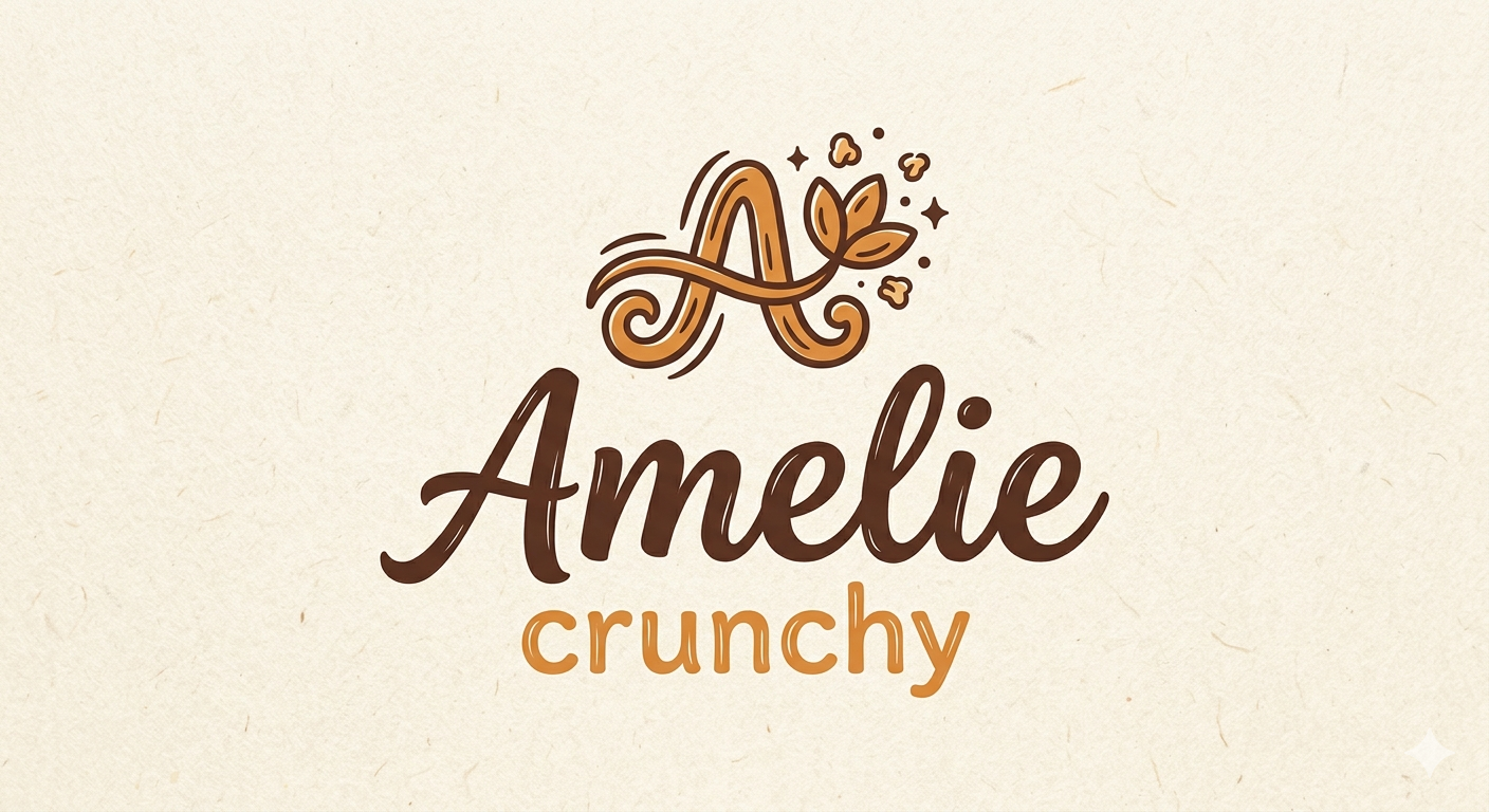
- Artisanal Monogram: Designed an ornate, custom letter “A” emblem woven with swirling dough-like curves, leaf accents, and floating crunch morsels—symbolizing freshness, craftsmanship, and flavor.
- Warm Color Palette: Selected a rich chocolate brown paired with golden caramel yellow, evoking natural ingredients, warmth, baked goods, and rich tastes.
- Handcrafted Typography: Combined a smooth script font for “Amelie” with a rounded sans-serif for “crunchy,” giving the product label a human, approachable, and comforting feel.
Key Deliverables
- Product Identity & Emblem System
- Brand Palette & Packaging Color Guidelines
- Label Typography & Custom Script Logotype
- Product Packaging & Visual Assets