About the Project
NovaReach Universal Ltd required a comprehensive brand transformation paired with a modern digital platform to solidify its presence as an industry-leading corporate enterprise. The project combined full brand identity development with a high-performance website build designed to elevate market perception and streamline engagement.
The Challenge
The objective was to translate NovaReach Universal Ltd’s strategic scope and operational strength into a visual language that feels grounded, scalable, and authoritative. The brand needed a clean corporate identity system and a responsive web architecture that delivers intuitive navigation for global partners and clients.
Brand & Design Strategy
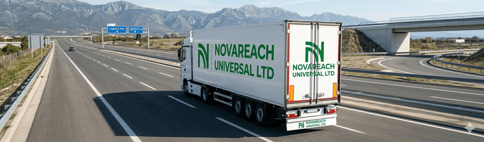
- Geometric Iconography: Designed a custom letterform emblem for the letter “N” incorporating sweeping arched paths, symbolizing expansive reach, connectivity, and continuous momentum.
- Color System: Anchored the identity in a vibrant, corporate emerald green against a stark white backdrop—conveying growth, stability, vitality, and professionalism.
- Typography: Utilized a bold, clean sans-serif logotype engineered for high legibility across digital interfaces, print collateral, and large-scale signage.
Website & Execution
- User-Centric Architecture: Structured a responsive, modern web interface optimized for smooth user journeys, clear service discovery, and fast loading speeds.
- Conversion & Lead Generation: Embedded clear call-to-action touchpoints and structured content hierarchies to convert visitors into strategic leads.
Key Deliverables
- Corporate Brand Strategy & Logo System
- Brand Guidelines (Typography, Color Palette, Grid Rules)
- Custom Digital Web Platform Development
- Responsive Web UI/UX Design System
PROJECT IMAGES